Collaborative Delivery
Insights 12.04.2024
Seismic Upgrades: Building Resilience for Safer Schools
Read More

Historic landmark. Complicated MEP incorporation. Showcase space with design-build features. These are just a few of the unique aspects of the Seattle Tower Lobby + Fifth Floor Amenity project, making it a perfect match for the collective talent of GLY’s Interiors | Special Projects [ISP] team. After working closely with Grayscale Design Studio to bring their vision of merging past and present to life, the team presented Seattle Tower tenants with a functional, fun, and interesting space complete with several statement pieces that are sure to spark conversation.
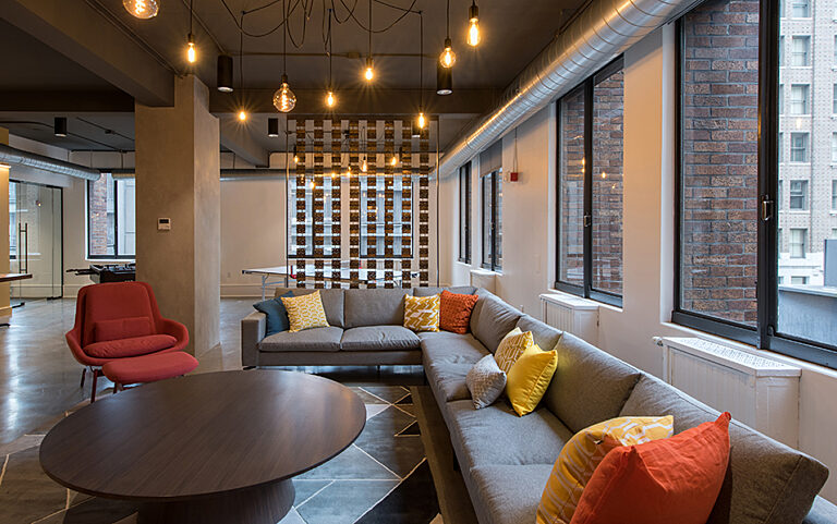
New, light-filled, modern-meets-historic Seattle Tower tenant lounge.
This 10,500 square foot landlord improvement project for Urban Renaissance Group is best described as an adventure—one with challenges, opportunities, surprises, and lots of teamwork to reach the finish line. After touring the new amenity floor and tastefully updated art deco lobby, you can’t help but wonder what it was like to pull this project off. We certainly had questions so we went straight to the source for answers: the GLY project team and Grayscale Principal Jennifer Thuma. Here is what they had to say:
Bryce Taylor, GLY: Constructed between 1928 and 1929 on University Street and 3rd Avenue, the 27-story Seattle Tower was originally known as the Northern Life Tower. It was the tallest skyscraper in the Seattle skyline for several decades—surpassing the famed Smith Tower in Pioneer Square due to its slightly higher elevation. The art deco interior finishes are truly stunning, largely consisting of marble flooring and wall covering, intricate brass detailing and gold leaf decorations. By combining concrete and steel to make the structure, with a tapering brick façade, the Seattle Tower embodied the cutting edge construction and engineering methodologies of the era.
Jennifer Thuma, Grayscale: The building designers envisioned a tower that mimicked Mount Rainier, tapering like the shape of the mountain and clad in brick that changed color tone as it rose to the top. The lobby represents a cave, filled with gold-toned ceiling ornamentation and brass/bronze accents. Throughout the upper floors are believed to be the original elevator surrounds, call lights, elevator doors and transoms. The building’s exterior and intricate art deco first floor lobby are registered historic Seattle landmarks.
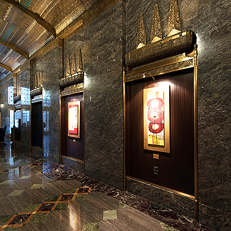
BEFORE | Main lobby niches with dark wood and artwork.
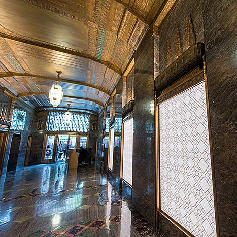
AFTER | Main lobby niches filled with backlit glass panels.
Terren Buchan, GLY: Ultimately, a project is successful if we strengthen existing relationships and establish new ones during the construction process. GLY approached this project with the requisite mindfulness to manage the overall complexity inherent to working in an occupied space, while mitigating the risks associated with remodeling aging building components. In the end, we delivered a space that provides great value to the building’s tenants.
Jennifer: We wanted to create an enjoyable and useful common area for building tenants complete with a working lounge, meeting spaces, a fitness facility, and locker rooms with showers. Preserving the historical atmosphere while incorporating new features and spaces in a modern, tasteful manner drove the design.
We were also tasked with improving portions of the main lobby—properly lighting the historic space, enhancing the original features, replacing unoriginal artwork in three niches, and designing a new security desk more fitting in size and style for the security staff.
Jace Curry, GLY: The construction team encountered a variety of challenges stemming from the age of the building, specifically during demolition and when integrating new MEP components to existing systems. GLY faced pervasive hazardous materials, aging in-slab electrical pathways, and fragile plumbing and steam heat routing.
Jennifer: We worked closely with the City of Seattle to ensure that our proposed changes on the first floor lobby didn’t infringe on the landmark requirements. The approved upgrades include:
The upper floors are not considered a historic landmark. We technically had the freedom to change everything but chose to keep the decorative elevator surrounds, ceiling, stone flooring and original bathrooms as a counterpoint to our modern design in the balance of the space.
Jennifer: We created some fun features with the original hardware as a nod to the building’s history. We used the old doors and transoms to build a story wall display with images of the building during its construction in 1928–1929. In order to separate two of the spaces, we hung 152 original door hinges in eight columns from floor to ceiling. The resulting screen does the trick in dividing the space without blocking natural light.
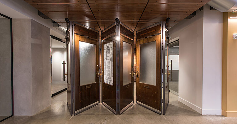
The team repurposed the original Seattle Tower doors into a story wall and room divider. Each panel shown above will display images of the building during its construction.
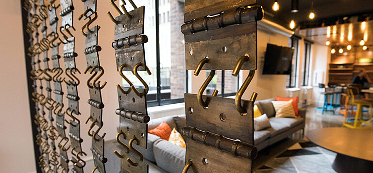
152 original door hinges serve as a screen to separate two portions of the lounge.
Jennifer: Because our design encompasses the entire fifth floor, we upgraded the areas surrounding the elevator lobby with a modern feel to suit the next generation of office users. We seamlessly integrated the transition from the old to the new as you enter level five from both the building exterior and elevator cabs.
In the main lobby on the first floor, we used modern twists on the historic patterns we saw within the building to, again, meld the new with the old—without recreating the old.
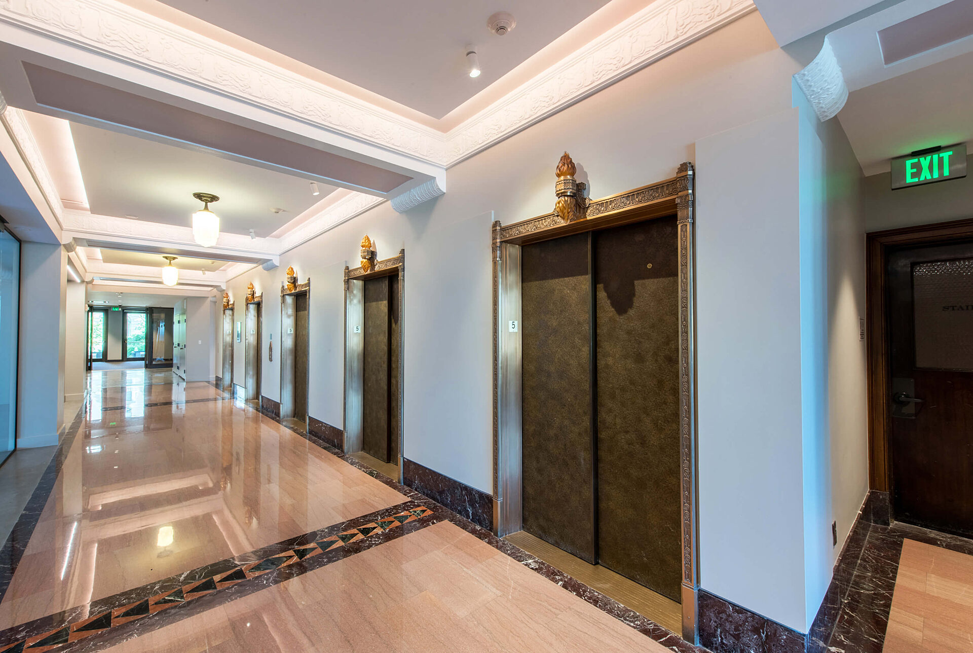
The fifth floor elevator lobby features the original decorative elevator surrounds, ceiling, and stone flooring—enhanced with fresh paint and replicas of the original lighting fixtures.
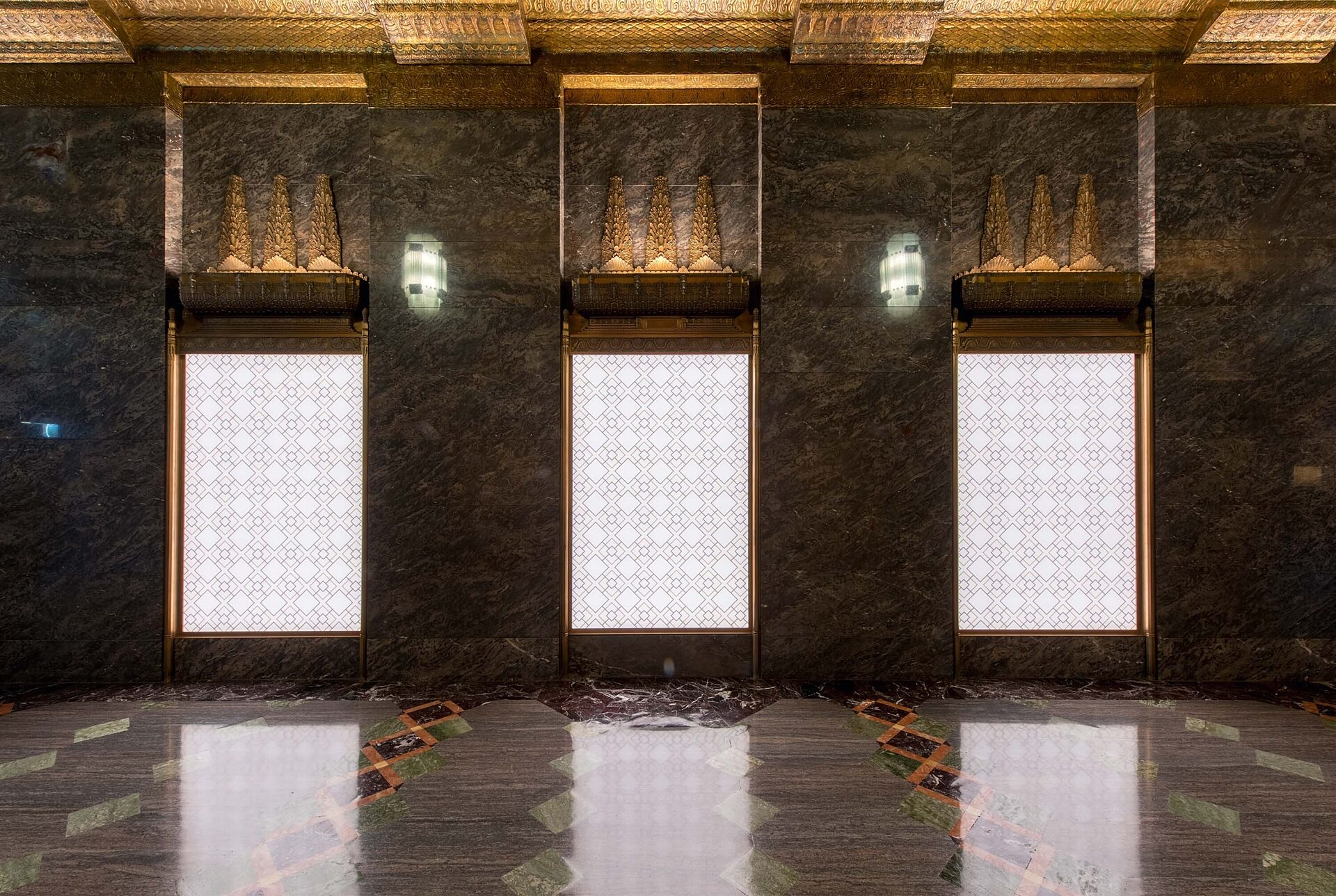
Patterned backlit glass panels bring much more light into the dark lobby.
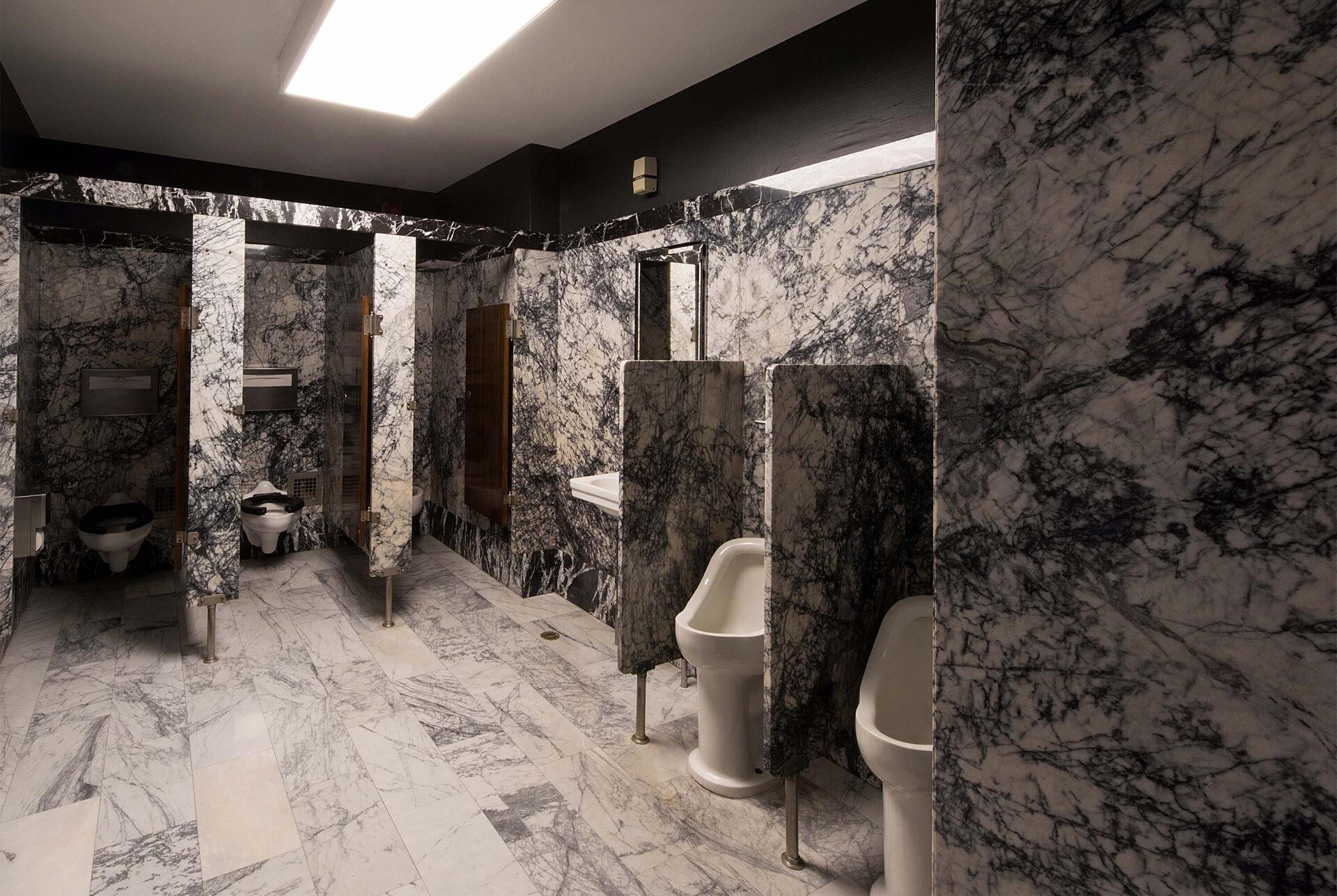
The floor-to-ceiling marble bathrooms remain as-is ... something you don't often see in this day and age.
Jon Evatt, GLY: GLY valued the chance to work side by side with the design team and ownership group to actualize a vision that integrated historical hardware into a modern space as unique pieces of art. After reviewing design drawings against the actual dimensions of the reused components and in close coordination with our in-house fabricators, Grayscale finalized the necessary details that allowed GLY to self-perform the fabrication, installation and finishing of these crucial components.
Jennifer: In the end, we created an amenity floor that enhances the Seattle Tower like never before. The tenants now have a beautiful, unique, and fun space with so much character that serves as an extension of their offices. The working lounge has soft seating areas, café tables, small meeting tables, a ping pong and foosball table to relax and play, a kitchenette for coffee and snacks, and a boardroom-sized meeting room that converts into a training room. The working lounge overlooks a roof deck—also available for tenant use. The new state-of-the-art fitness facility features all new equipment with large locker rooms, showers, and changing rooms. Giving this amenity to the building not only boosts the leasing offering but serves as a communal space where different tenants can mix and meet.
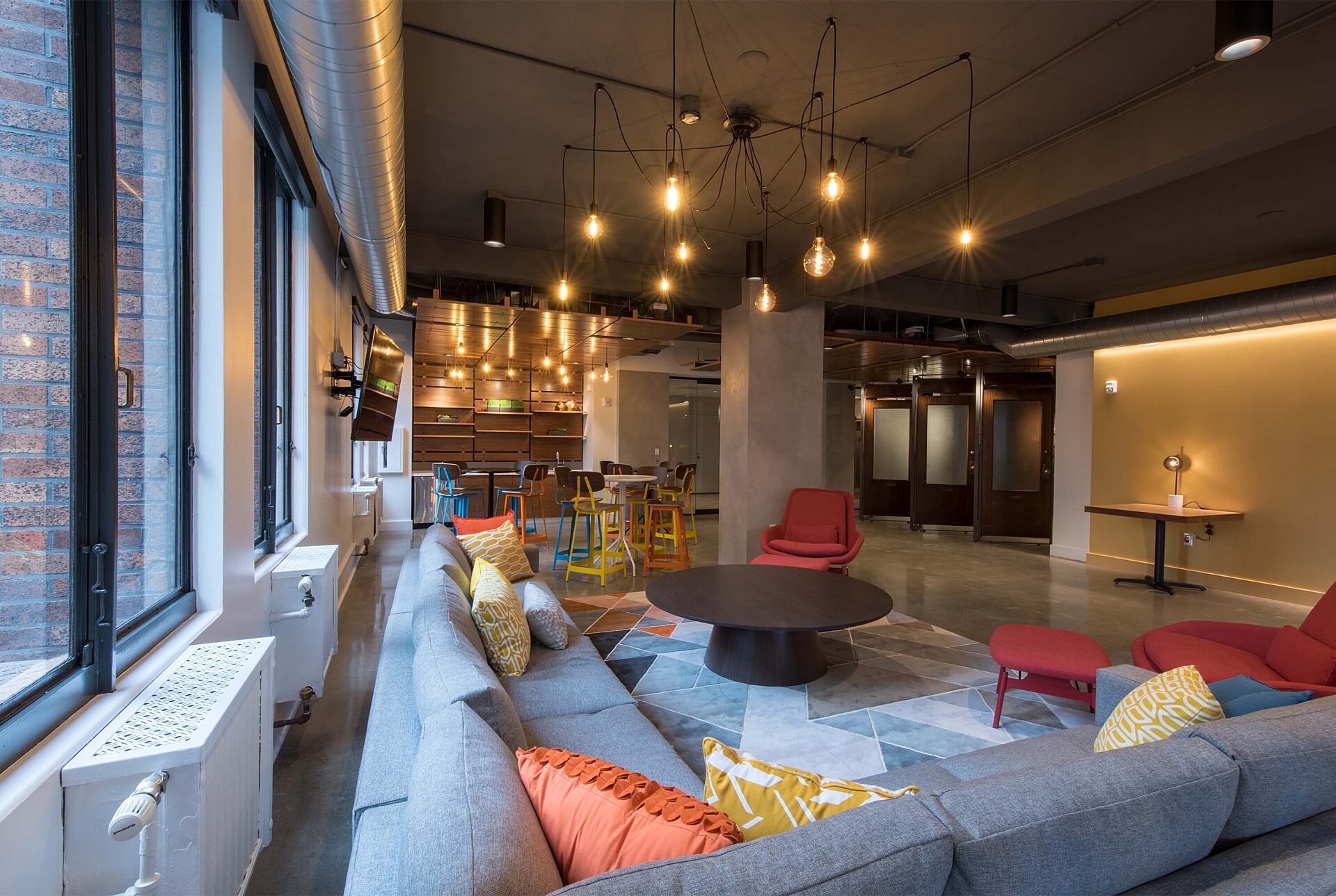
Seattle Tower's new tenant working lounge, dining space, and kitchenette.
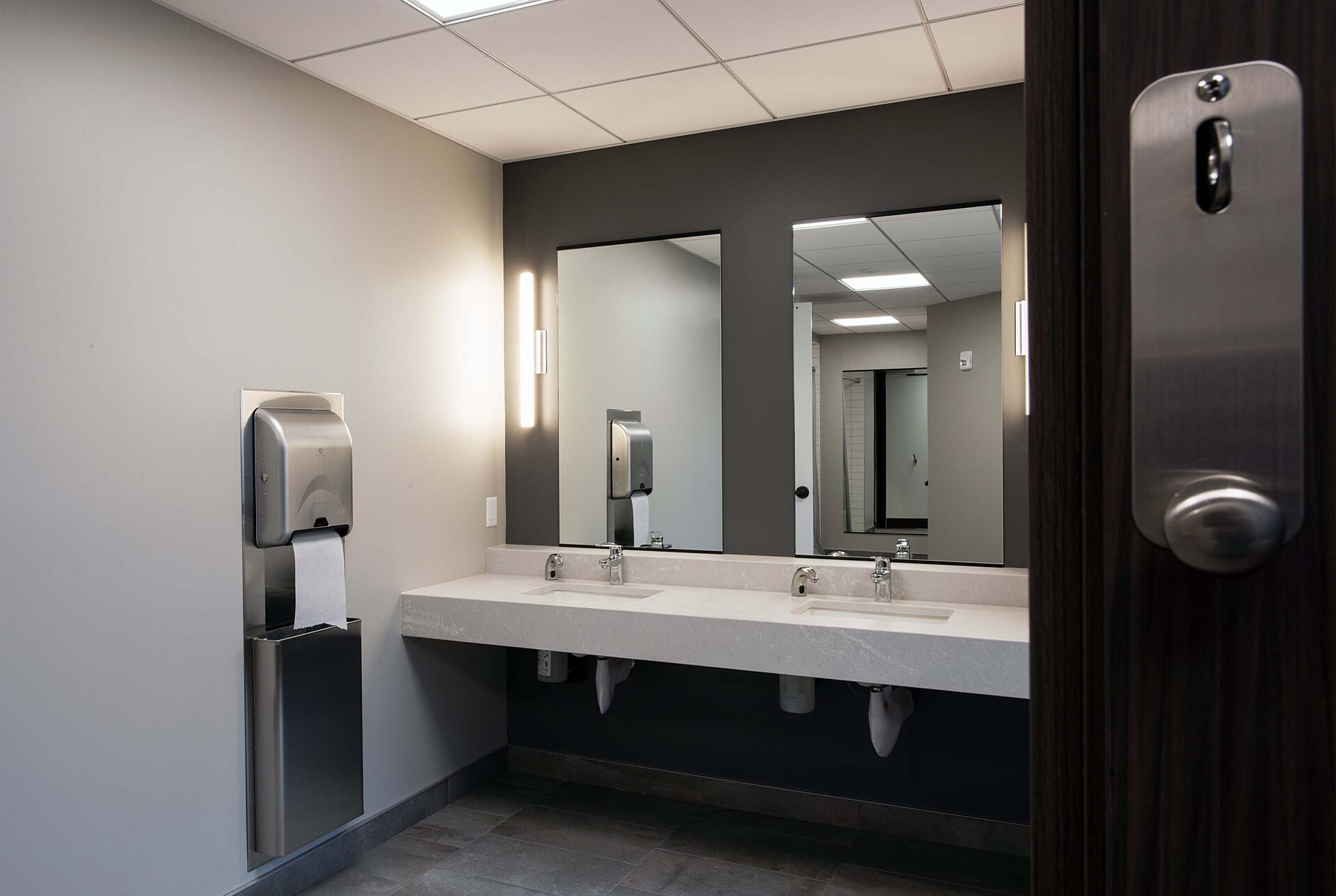
New men's locker room includes showers and ADA compliant restroom.
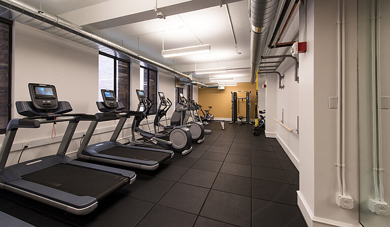
The new Seattle Tower amenity space features a state-of-the-art workout facility.

Marketing Manager
CPSM
Janine feels at home in the world of marketing since it combines her passion for art, writing and graphic design with her natural ability to organize, strategize, and analyze. While she enjoys her day-to-day responsibilities, facing new challenges, and the many opportunities to apply her creativity, her favorite part about her job isn’t even marketing-related; she loves working with people and getting to know everyone in the company top-down—from estimating to IT to the hundreds of hard-working craftspeople out in the field.